Avocados From Mexico
OVERVIEW
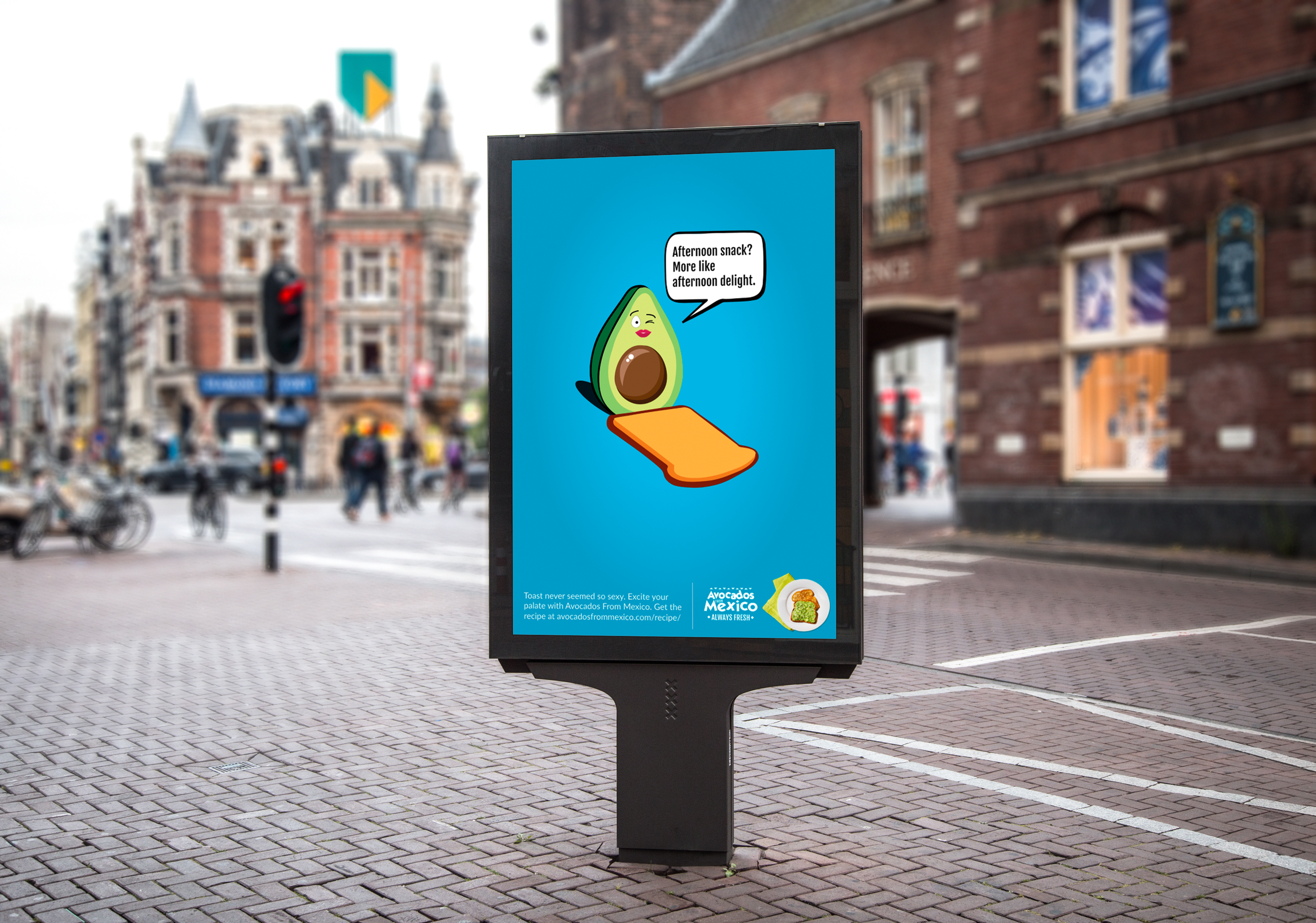
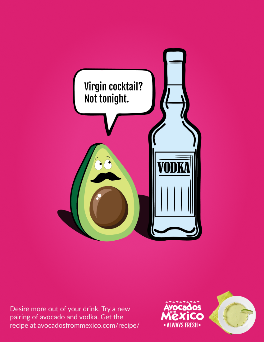
This project’s goal was to create a print campaign for Avocados From Mexico. Avocados From Mexico are always fresh, therefore, inspiring this series of print ads to keep things fresh between avocados and other unexpected ingredients. Personifying the avocados to flirt with other ingredients achieves this effect in a humorous, tongue-in-cheek kind of way.
ROLE
Art Director
CLIENT
Avocados From Mexico
CAPABILITIES
Concepts
Advertising
Art Direction
Print Design
Illustration
THE PROCESS
INITIAL ROUND
These print ads took several rounds of revisions and edits to carry to completion, some of which are presented here. I began with cartoon-like avocados, not yet personified, in combination with other ingredients. The background was based off the Avocados From Mexico brand colors, just like the end result, but also had three different patterns.
SECOND ROUND
Round two consisted of adjusting the pink background slightly, changing the container holding the ice cream, and personifying the ingredients by adding facial expressions.
THIRD ROUND
This round changed the avocado’s face from the one with a mustache to three different faces: One traditionally male, one traditionally female, and one gender neutral. It also removed the faces from the other ingredients.
FINAL ROUND
The last round had by far the most revisions. To make it look more like a print ad and less like a poster, I added product shots to the bottom and changed the background patterns to a slight radial gradient. The green print ad needed some editing to look more natural. To do this, the avocado and ice cream were rearranged. Copy was also edited in this round.


