Chicken Profit Calculator
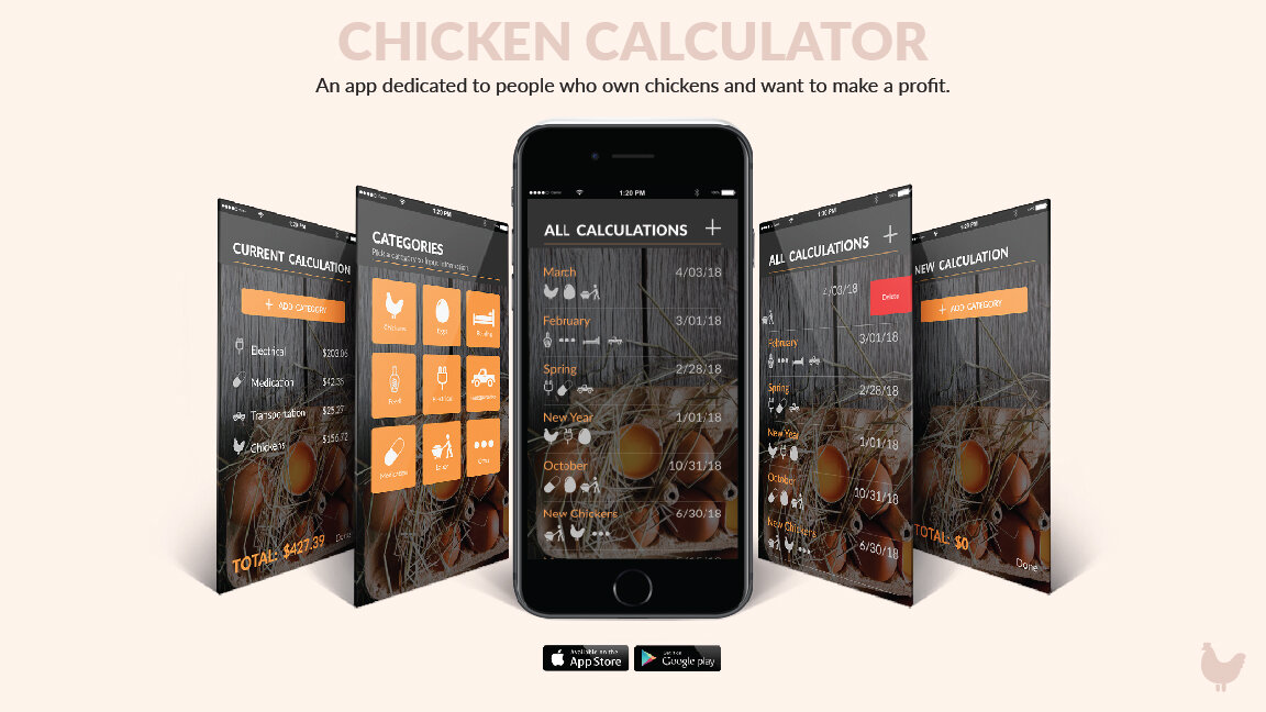
This project’s goal was to create a simple mobile application to fulfill a user need. The market I chose to focus on in this case needed a way to calculate money spent on chickens owned and possible profit in the future—i.e. a chicken profit calculator. The application is intended for someone who already owns chickens, or will in the future, and wants to calculate the money they have spent, so that they can make a profit.
OVERVIEW
ROLE
UX Designer
CLIENT
Poultry Farmers
PROTOTYPE
High Fidelity Mockup
CAPABILITIES
UX Design
UI Design
Interaction Design
Mobile Experience
User Research
Branding
POULTRY FARMERS
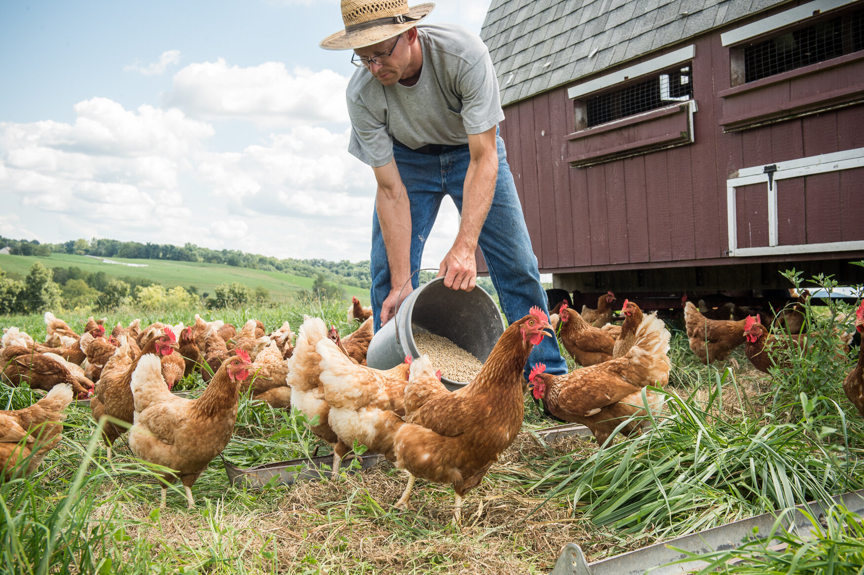
Early on in the project I decided I wanted to challenge myself by designing for a persona that was completely different from me. I thought of people in my life and realized that I knew someone of the opposite sex, a different generation, and completely different mindset than myself. This person owns chickens and hopes to eventually make a profit from them. After choosing this person to inspire my persona, I knew I wanted to make an app for someone that owned chickens. It was only after talking to this person, however, that I realized there wasn’t a great app, or resource in general, to calculate the money spent on owning chickens and estimate profit capability. Anything currently available is too complicated, confusing, and not easily accessible. The user’s goal is to calculate the total spent on the chickens in a certain time period so that they can sell their chickens for a higher amount, ultimately making a profit. The experience is supposed to be easy, organized, and helpful.
THE PROCESS
INITIAL IDEA / PAPER PROTOTYPE
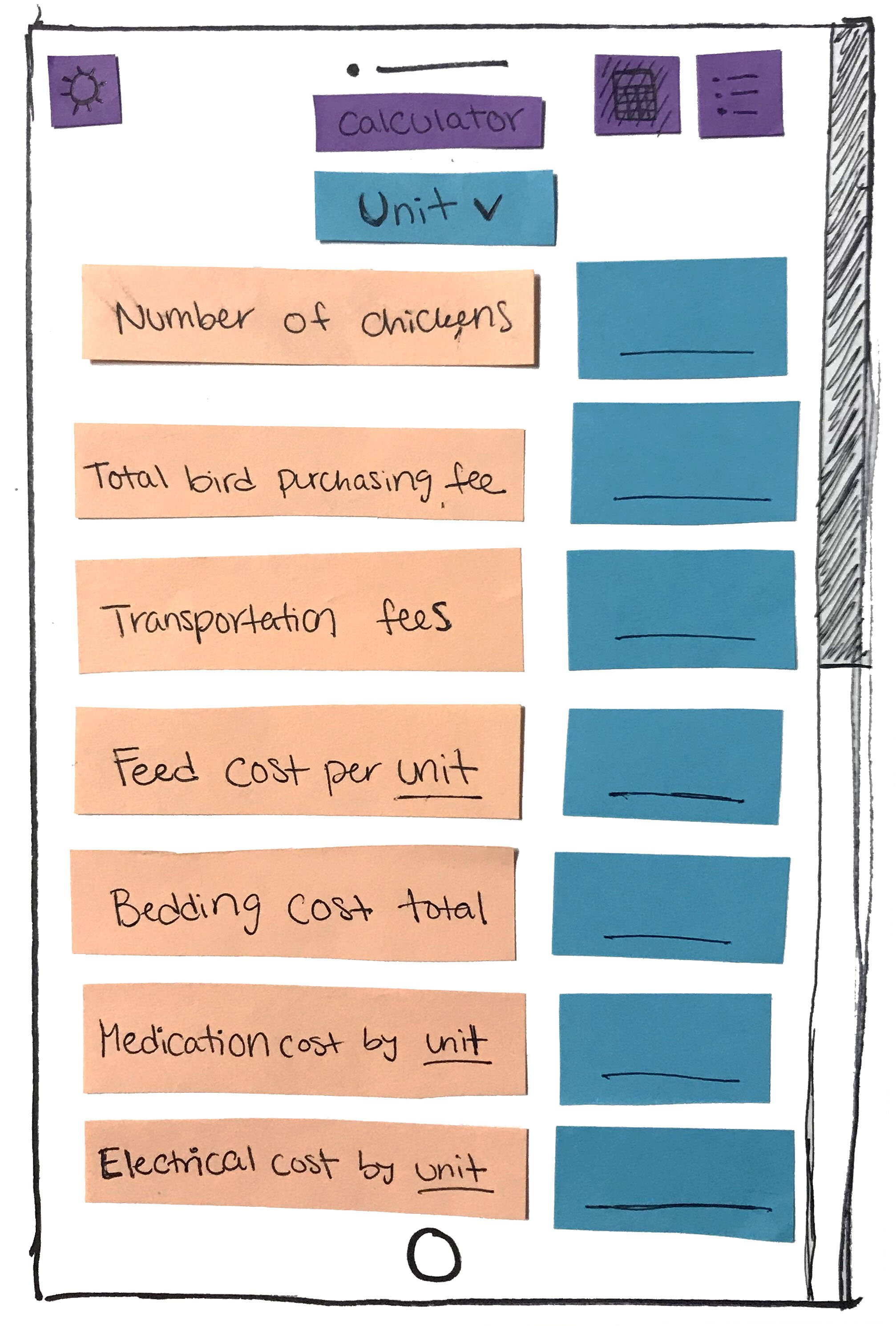
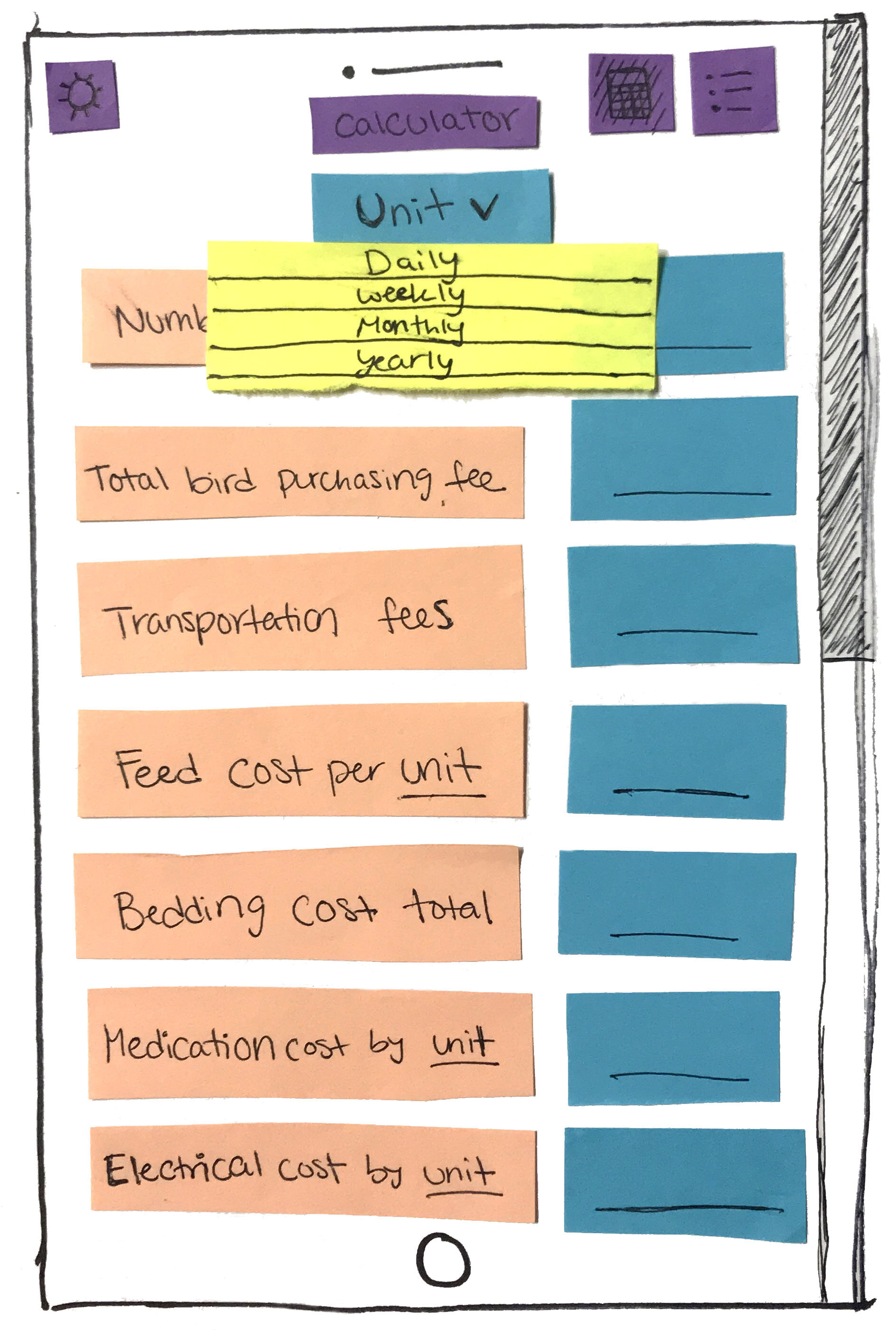
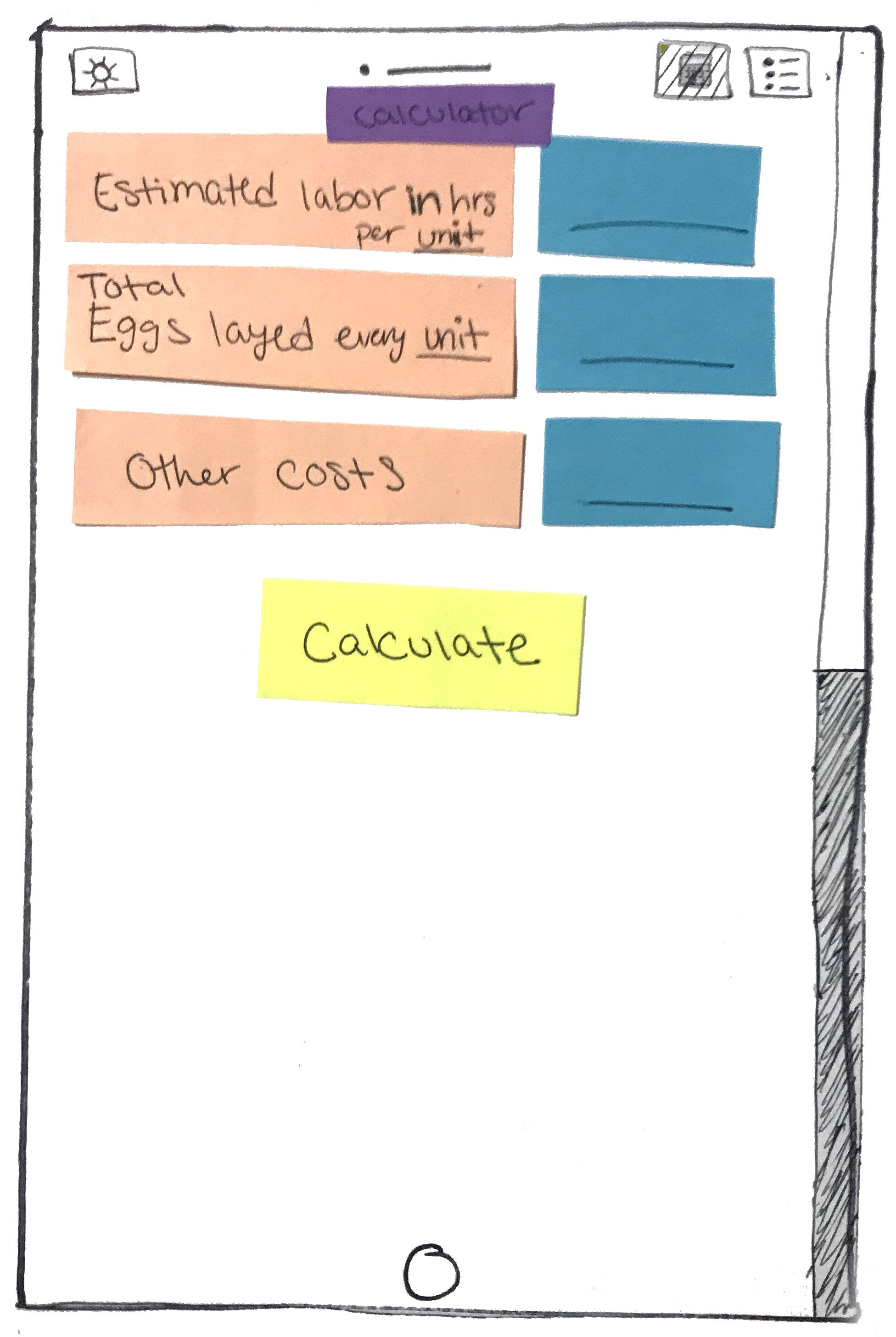
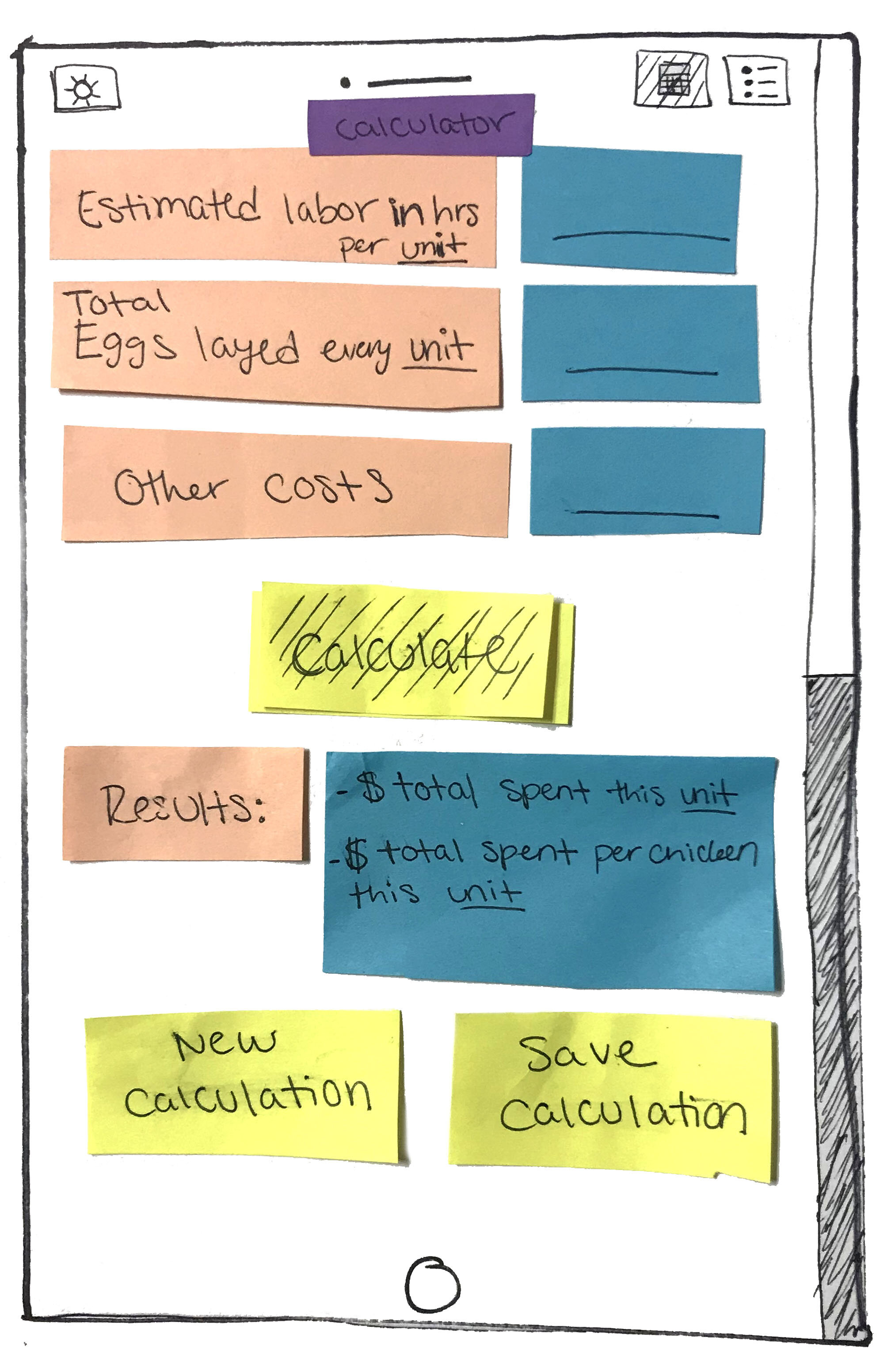
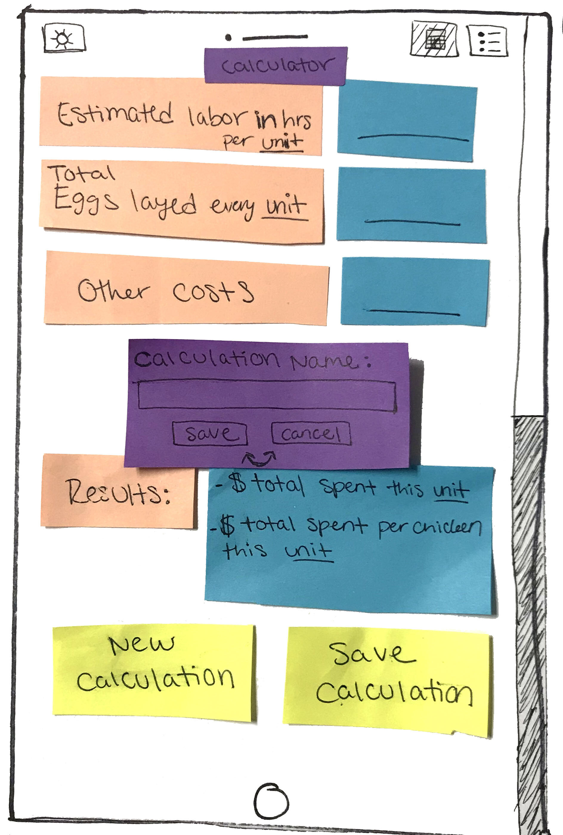
My original idea was to have three main pages: Current calculation, previous calculations, and settings. The current calculation's unit, such as month or week, would be selected by the user before scrolling down one long page and entering information based on each category. These categories could be number of chickens, transportation fees, bedding cost, etc. After the user finished entering the information, they would tap the calculate button to get the results of how much they spent in total and per chicken in that unit time. After this, they’d be able to save the calculation to refer to later, or start a new calculation without saving. A paper prototype was made emulating this design. The feedback received was that the prototype was confusing, too long to scroll, and wasn’t very intuitive.
BACK TO THE DRAWING BOARD
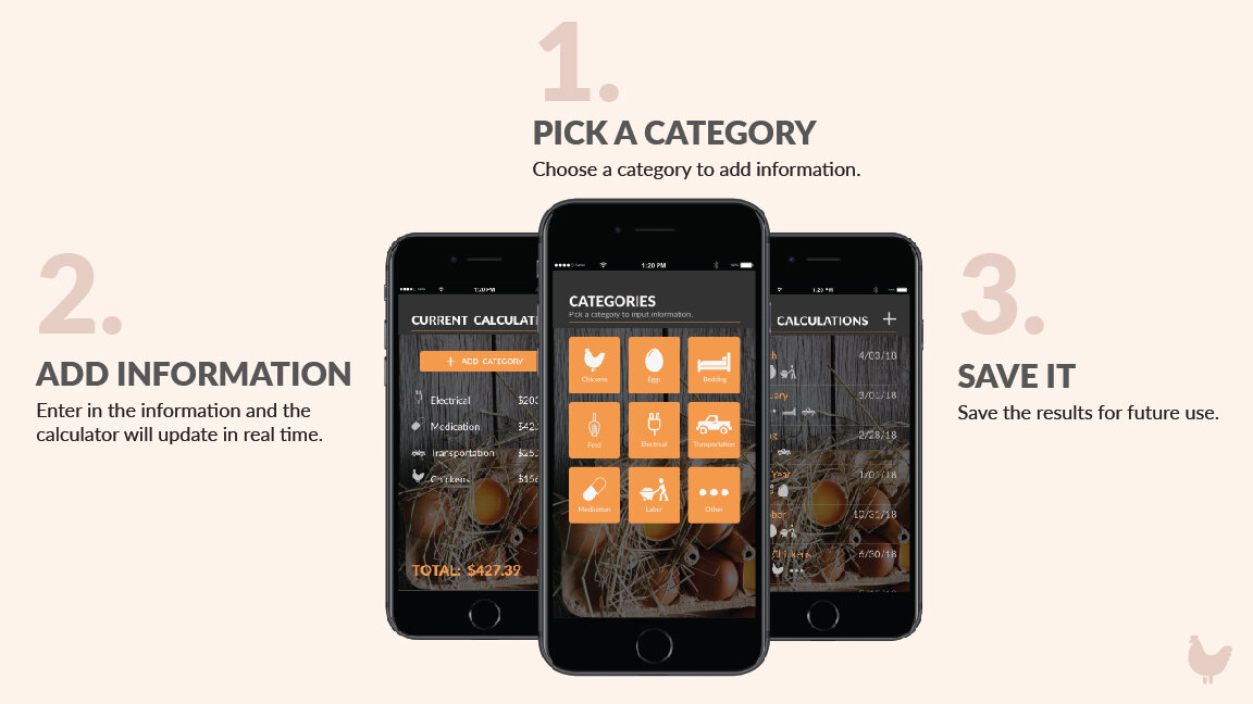
After getting this information I decided to revise my design approach and idea. I talked to peers to see what they thought would make sense to them and what would be the best way to organize such different categories of information. It became clear at this point that the first page should contain all past calculations and that there should be an add button at the top to make a new calculation. After tapping this add button, a new page will open for the current calculation. On this page, the user can select a button to add categories of information and see the already added categories with the prices entered. When the add category button is selected, a menu of square icons representing categories pops up, making it easy for the user to select the category they desire to enter information about. The calculation will update in live time so that no calculate button will be needed. Once the user hits the done button, the app will ask them if they wish to save the calculation. At this point they can enter a name for the calculation and save it for future use.
WIREFRAME MOCKUP
In order to make the experience easy, organized, and helpful, it was clear that the application needed to be designed in a way that seemed intuitive and familiar to users. For the All Calculations page, I looked for inspiration from messaging aspects of apps and messaging apps themselves. This design helped achieve the familiarity needed to approach the main page of the application. For the Categories page, icons were used, in combination with key words, in order to make selection easier and quicker for the consumer. Icons are universally recognizable and can be identified much faster than a word. Peers tested the wireframe mockup and reported that they really liked the layout and icons. They also felt it needed a bit more space around the top, and that I needed to add icons in other places.
HIGH FIDELITY MOCKUP
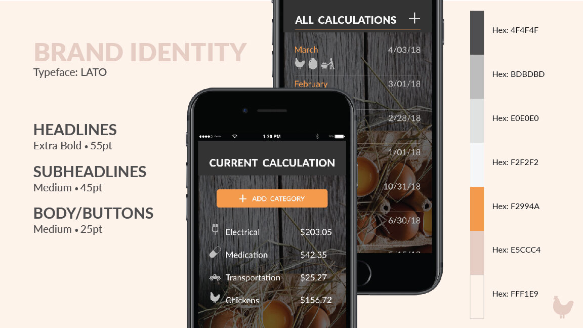
With this feedback in mind, I improved my design and developed a brand identity for the application. My goal for the design was to not become overly chicken inspired and not be too extreme on either the masculine or feminine side. Some of the colors were based off the chicken aspect, while others remained neutral mediating colors. Once the colors were chosen, a few varieties on the type ended with an all-caps version of Lato for the titles and lowercase for the descriptors. This is a great sans-serif typeface for web and mobile apps. As I continued to refine the branding and design elements, it was clear that this app would meet its intended market’s needs.
CONCEPT MOCKUP BOARDS
