
Proximity Branding
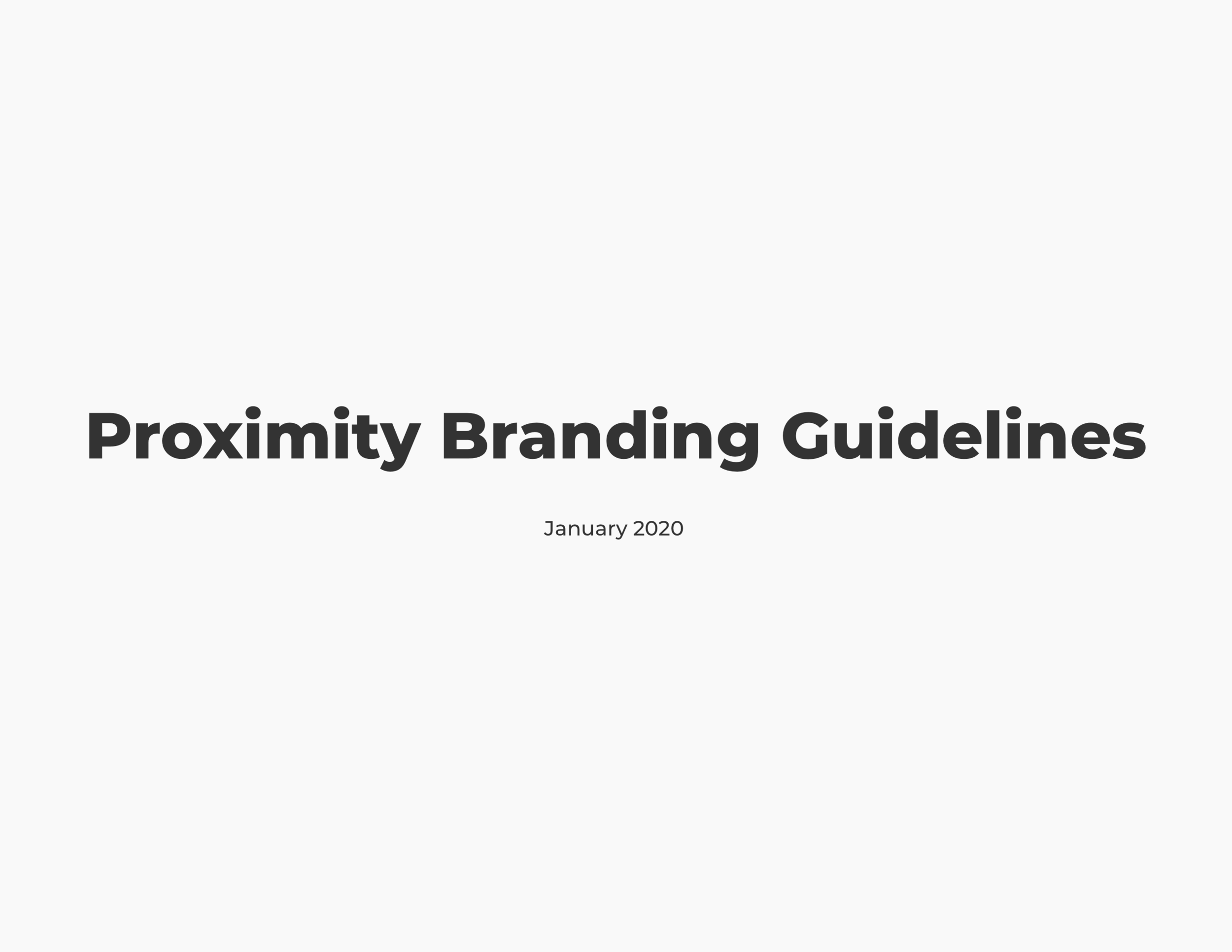
Proximity provides software for coworking space owners to easily manage their space. In order to not compete with the space’s branding, a more neutral brand identity was needed. In addition to this, a design system was required to create and maintain consistency across all products and keep the development process smooth and quick.
OVERVIEW
ROLE
UX Designer
CLIENT
Proximity Space, Inc.
CAPABILITIES
Branding
UX Design
UI Design
Interaction Design
Creative Direction
Accessibility







PROXIMITY SPACE, INC.
Proximity was founded in 2017 with the mission to connect the mobile workforce through a growing network of independent coworking spaces. They help hundreds of space owners and managers simplify logistics and more easily manage door access, billing, conference room booking, events, and guest visits. In addition, Proximity also helps entrepreneurs, remote workers, and digital nomads access coworking spaces where they’ll find a supportive and like-minded community. They’re a people company that happens to create software for coworking spaces.
COMPANY
COWORKING
What is coworking you ask?
Coworking is the new way of working and sharing. It’s not just about sharing a building and cost, it is about belonging to a community. Think of it as a gym membership for office space. Coworking spaces are designed to provide a productive and collaborative environment for their members and are created without corporate constraints on what is perceived to be a traditional office environment. Members are able to work alongside other professionals without being a part of the same company. This creates communities and fosters network growth.

GOALS
Before the redesign, Proximity had a logo, two typefaces, and a five step gradient that included the primary colors of the brand. While this allowed them to establish their brand and develop a personality, the company eventually grew to a point that required a fresh look and less invasive branding. The task was to create a design system that felt timeless, clean, and approachable, while still embodying the fun side of Proximity.
THE PROCESS
DELIVERABLES
Logo misuse
Dark mode gradient
Dark mode colors
Alert state colors
Better alerts
Ten steps of gray
New brand typefaces
Updated buttons
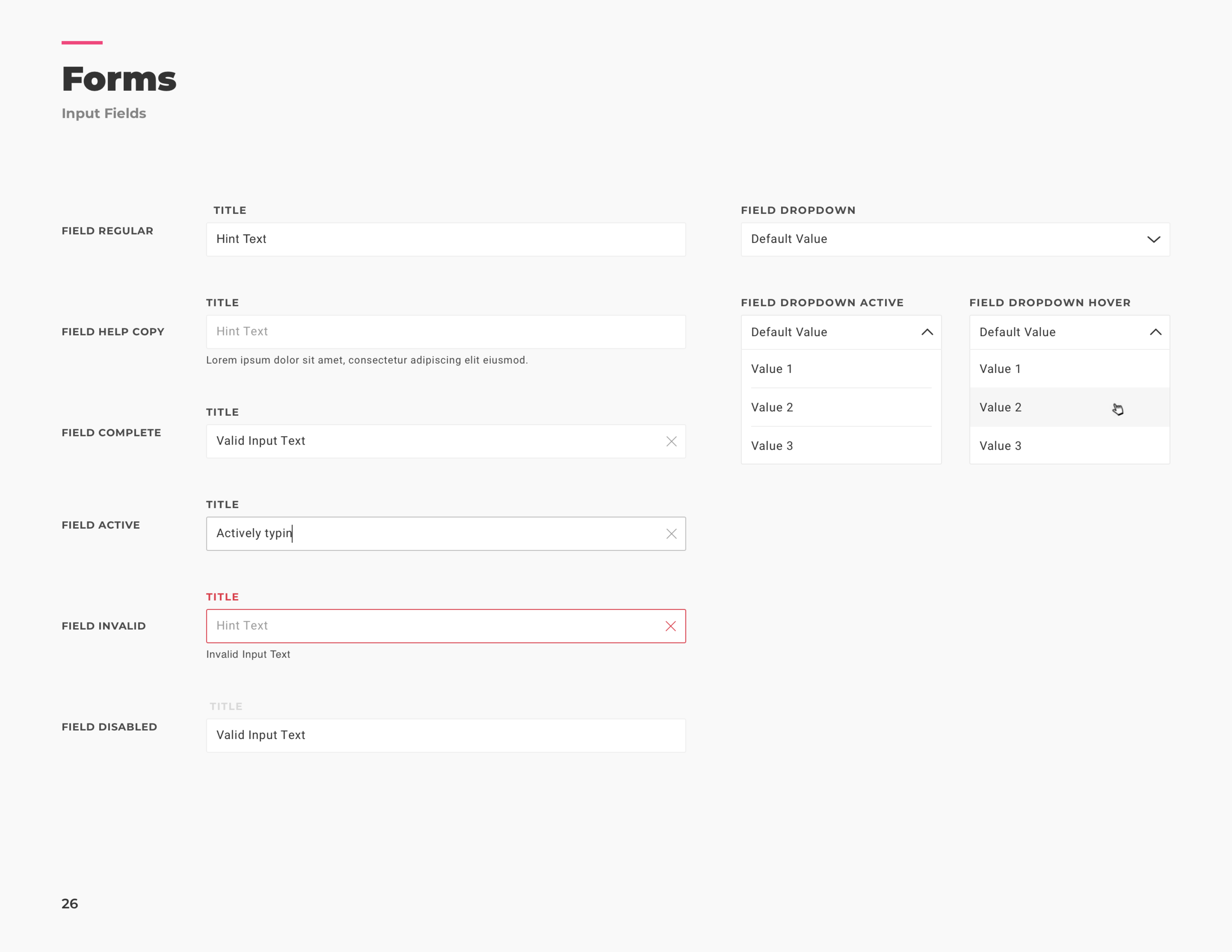
New input fields

COLORS
One of the main requests of this project was to determine what Proximity’s dark mode colors and gradient would be, so that in the future the products could be offered in either light or dark mode. This was a challenging task as the original five Proximity colors could not be changed, nor could they be used for dark mode. After a long search for the perfect combination, the six dark mode colors were chosen.

GRAYSCALE
The contrast created by pure black and pure white on digital screens can be difficult to read and tiring on the eyes. Due to this, we must use different shades of gray and try never to use 100% black or white. The original brand identity did not define a grayscale, and therefore many different grays were being used. In order to create and maintain consistency, the ten steps of gray were defined.

ALERT COLORS
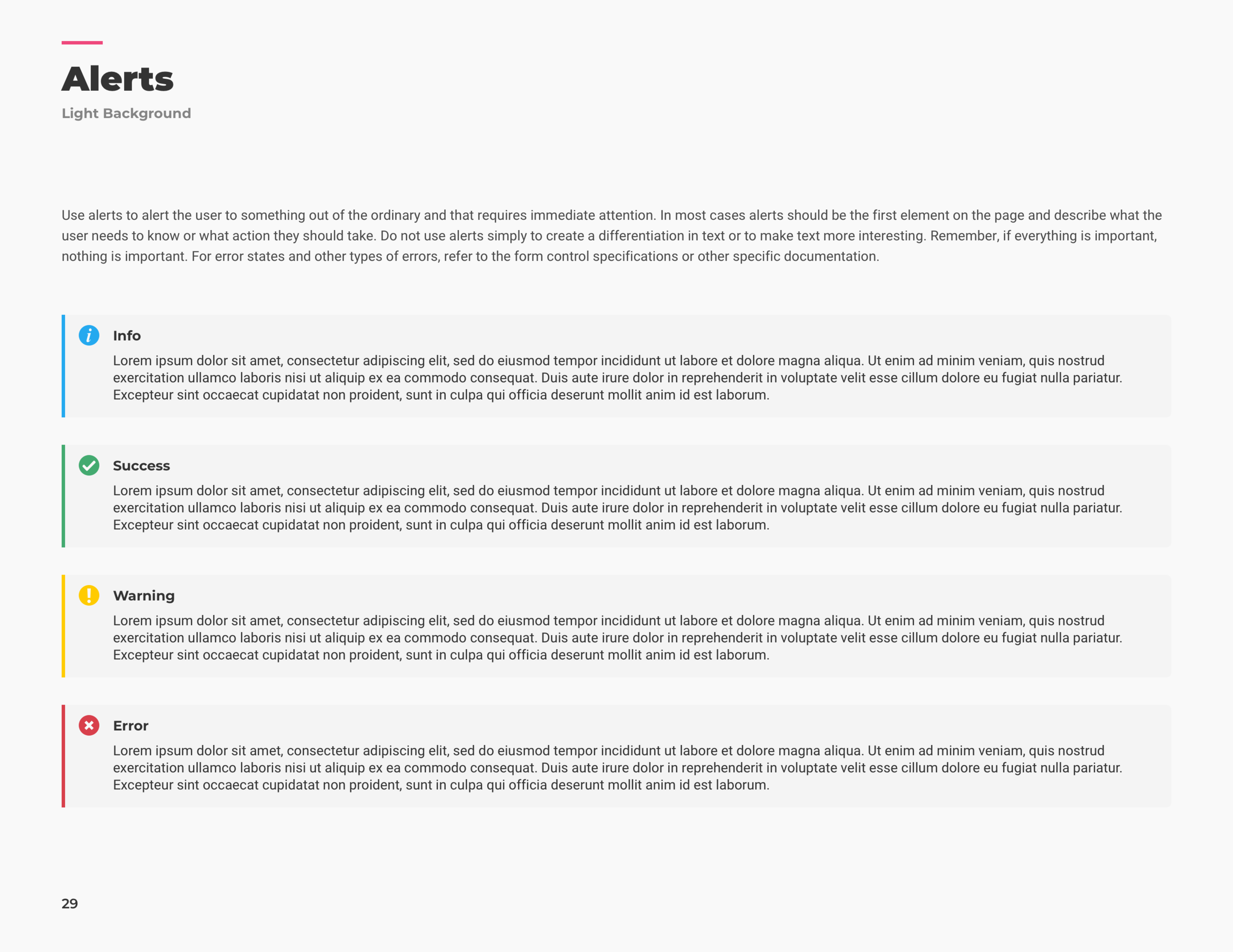
In addition to not defining a grayscale, the original brand identity did not include alert state colors. This led Proximity to use Bootstrap alerts. The new colors were chosen strategically so that they would be noticeable in both light and dark mode, preventing the need for two sets of colors. They are also much more appealing and eye catching than the pastel colors used by Bootstrap.

TYPOGRAPHY
The typefaces originally chosen for Proximity were Gotham and Roboto Condensed. While Gotham is a bold geometric typeface that can be very pleasing to the eye, the way it was used came off very heavy and intrusive. All headings used Gotham bold italic. In fact, every time Gotham was used it had to be italic. Along with this, the sizing of headings was very large and the color was always true black, making it overwhelming for the viewer.
Montserrat and Heebo became the new brand typefaces. They are both Google Fonts, making them affordable for Proximity and accessible to many. Montserrat makes the site feel timeless and clean while still maintaining the approachable personality Proximity embodies. Heebo gives the paragraphs more personality than they had before, while still keeping letters clean and universal.

BUTTONS
Before the branding guidelines were made, there was very little consistency throughout Proximity’s software. The buttons included every color, shape, and style imaginable. This ultimately confused users and made it difficult to learn the software. To simplify this, the new button styles were created and reassigned to all buttons in the program. This change helped make the software feel clean and easy to use.

ALERTS
Proximity was using Bootstrap alerts everywhere in their software. While useful in some scenarios, they were overused and unattractive. Alerts are meant to notify the user to something out of the ordinary and that requires immediate attention. In most cases alerts should be the first element on the page and describe what the user needs to know or what action they should take. The new alert style is eye catching and appealing without overwhelming the user.


TAKEAWAYS
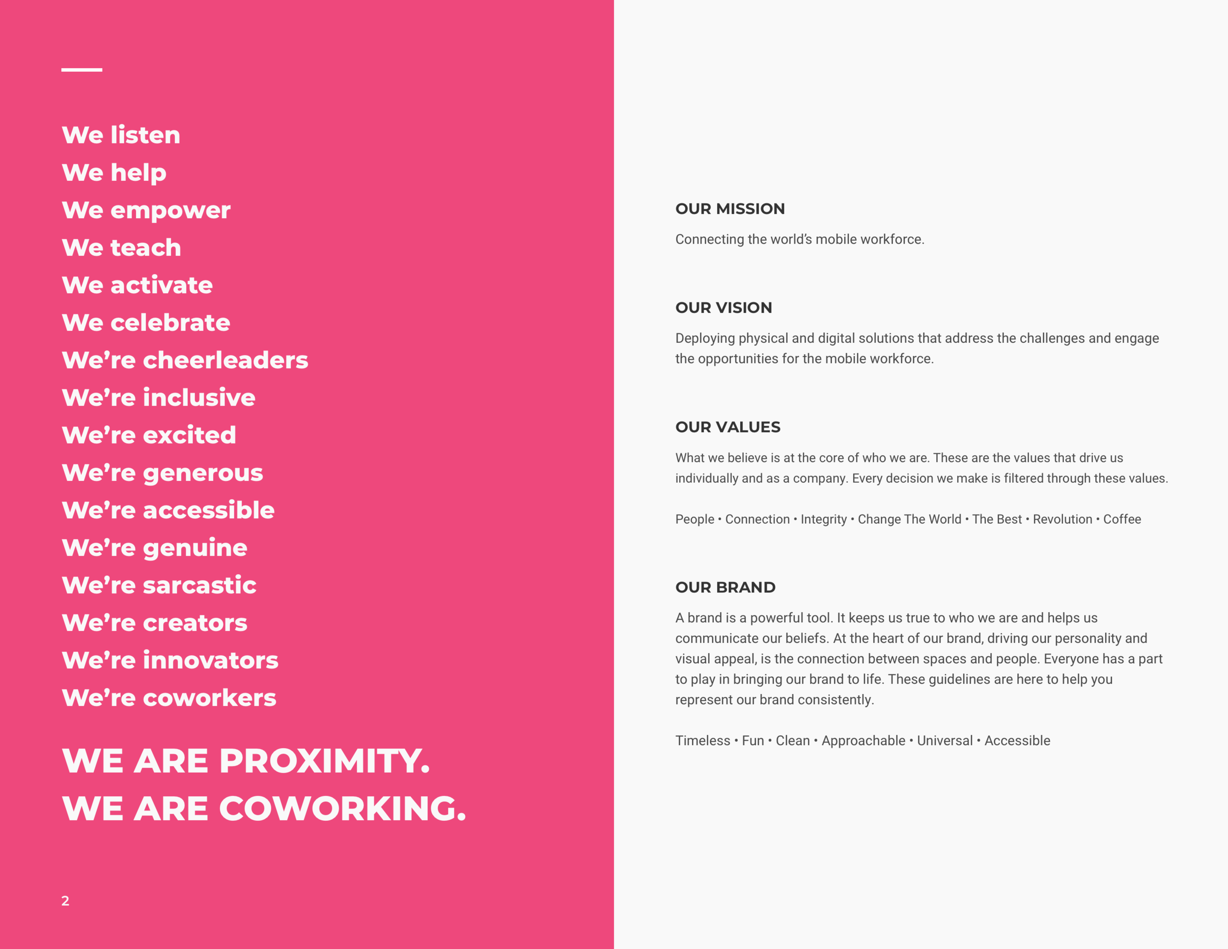
A brand is a powerful tool. It keeps a company true to who they are and helps them communicate their beliefs. At the heart of Proximity’s brand, driving their personality and visual appeal, is the connection between spaces and people. Everyone has a part to play in bringing the brand to life. These guidelines were created to help Proximity represent their brand consistently and effectively. In addition to colors, typefaces, buttons, and alerts, this project also updated metrics, input fields, and other forms in order to create much needed consistency and update the brand. The new user interface allows space branding and content to take center stage, while still remaining true to the core of Proximity’s personality.

