
Vault Aligns to the
Design System
This project was undertaken to turn Vault into a consistent scalable user-focused application by integrating it with the Ardent Mills Design System. To achieve this, the project focused on expanding the design system, implementing global styles, and redesigning every screen in Vault. While the project faced challenges related to estimation, development resources, and multi-team dependencies, it ultimately delivered on its core objectives, demonstrating the value of a design system-driven approach and providing key learnings for future initiatives.
OVERVIEW
ROLE
Project Lead & Lead Product Designer
CLIENT
Ardent Mills
DESIGN TEAM
Lead Product Designer
Contracted Product Designer
Junior Product Designer
CAPABILITIES
Product Design
Product Ownership
Design Ops
Design Strategy
Information Architecture
Interaction Design
Accessibility
Governance
Content Strategy & Writing
OVERVIEW BY METRICS
80%
Increase in design system components
1,260
Frames created to redesign every screen in Vault
1,159
Frames created to redesign Vault’s alerts
920
Work items created in AzureDevops
ARDENT MILLS
Founded in 2009 from the merger of two industry giants, Ardent Mills is North America's leading flour supplier. They source grain from across the continent, meticulously milling it into the building blocks of countless meals.
But Ardent Mills goes beyond just producing high-quality flours and whole grains. They're passionate and committed to working alongside farmers to cultivate a more sustainable future for food. They're not just manufacturing ingredients; they’re cultivating a thriving agricultural ecosystem that nourishes their communities one grain at a time.
COMPANY
PIONEERING DESIGN
I joined Ardent Mills to found their UX practice and build a design-driven approach to software development. As their first Product Designer, (the company hadn't yet integrated design into their workflow) I had the unique opportunity to build a design practice from the ground up and champion user-centered design.
The initial days were spent building the foundation. This included creating a design system, establishing developer/designer workflows, building a core set of design tools, and raising awareness on the benefits of design. Slowly, but surely, design started gaining traction, and the design practice I built evolved from a solo mission to a collaborative force. With additional designers under my leadership, we transformed how the company approached product development and user experience.

The use of multiple outsourced teams to develop Ardent Mills applications created a significant problem: a lack of consistency. This resulted in fragmented user experiences across business-critical digital products. Vault, Ardent Mills’ commercial app, was inconsistent, outdated, and full of poor UX practices. This led to frequent errors and inefficiencies which impeded users' ability to effectively achieve their goals. In addition to this, the app's complexity made onboarding new users difficult which was a critical concern.
THE PROBLEM
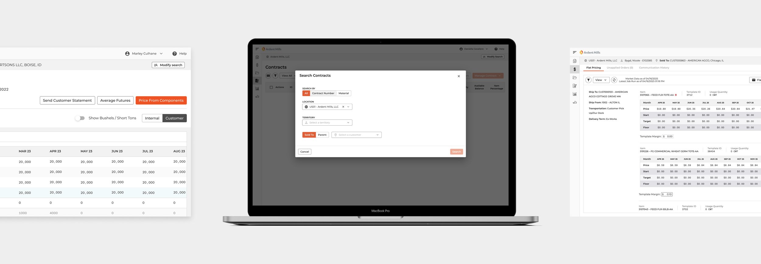
VAULT BEFORE
GOALS
This project aimed to bring the Vault application into alignment with the established Ardent Mills Design System, focusing on improved user experience and scalability. To achieve this, the initiative pursued two key objectives: first, to create a more intuitive user experience by ensuring Vault's adherence to industry best practices and the integration of the design system's styles, components, and guidelines; and second, to lay the groundwork for scalability and faster delivery. The latter was supported by key results that included reducing hardcoded styles, consolidating component options, and decreasing the utilization of non-component elements.
THE PROCESS
DELIVERABLES
Current State Map
Implementation Strategy
Design System Additions
High Fidelity Designs
User Stories & Expanded Responsibilities
CURRENT STATE MAP
Prior to initiating design changes, a thorough Current State Map of the Vault application was created. This deliverable encompassed the documentation of current user flows, UI components, and information architecture. A key objective was to pinpoint existing inconsistencies and user pain points that hindered effective use of the application. This map served as a crucial foundation, providing the design team with a clear understanding of the application's initial state and a framework for identifying necessary improvements.
A key part of the current state mapping process was a detailed analysis of inconsistencies within the Vault application. This analysis revealed several key areas of concern. By thoroughly documenting these inconsistencies, the design team gained a clear understanding of the problems that the redesign needed to address.
Visual Inconsistencies
The application exhibited a lack of consistent application of colors, typography, spacing, and UI elements. This resulted in a fragmented and disorganized appearance, making it difficult for users to perceive Vault as a cohesive product.
Functional Inconsistencies
Functional inconsistencies were a significant problem within the Vault application. For example, input fields had three or more distinct styles, some of which appeared editable but were not. This inconsistency increased the cognitive load on users, forcing them to learn which fields were actionable instead of relying on intuition.
Deviation from Best Practices
There were several instances of deviation from established UI best practices. The semantic meaning and expected behavior of form controls were often disregarded. This deviation from best practices created inconsistencies in the application's interaction patterns, leading to user error and decreased efficiency.
IMPLEMENTATION STRATEGY
To ensure a smooth transition, a phased implementation strategy was developed. This strategy defined the scope of each phase, the sequence for updating components and styles, and the release timeline. This phased approach offered several key benefits: it allowed for a controlled and iterative rollout, minimized disruption to users, enabled prioritization of the most critical elements, and optimized resource allocation.
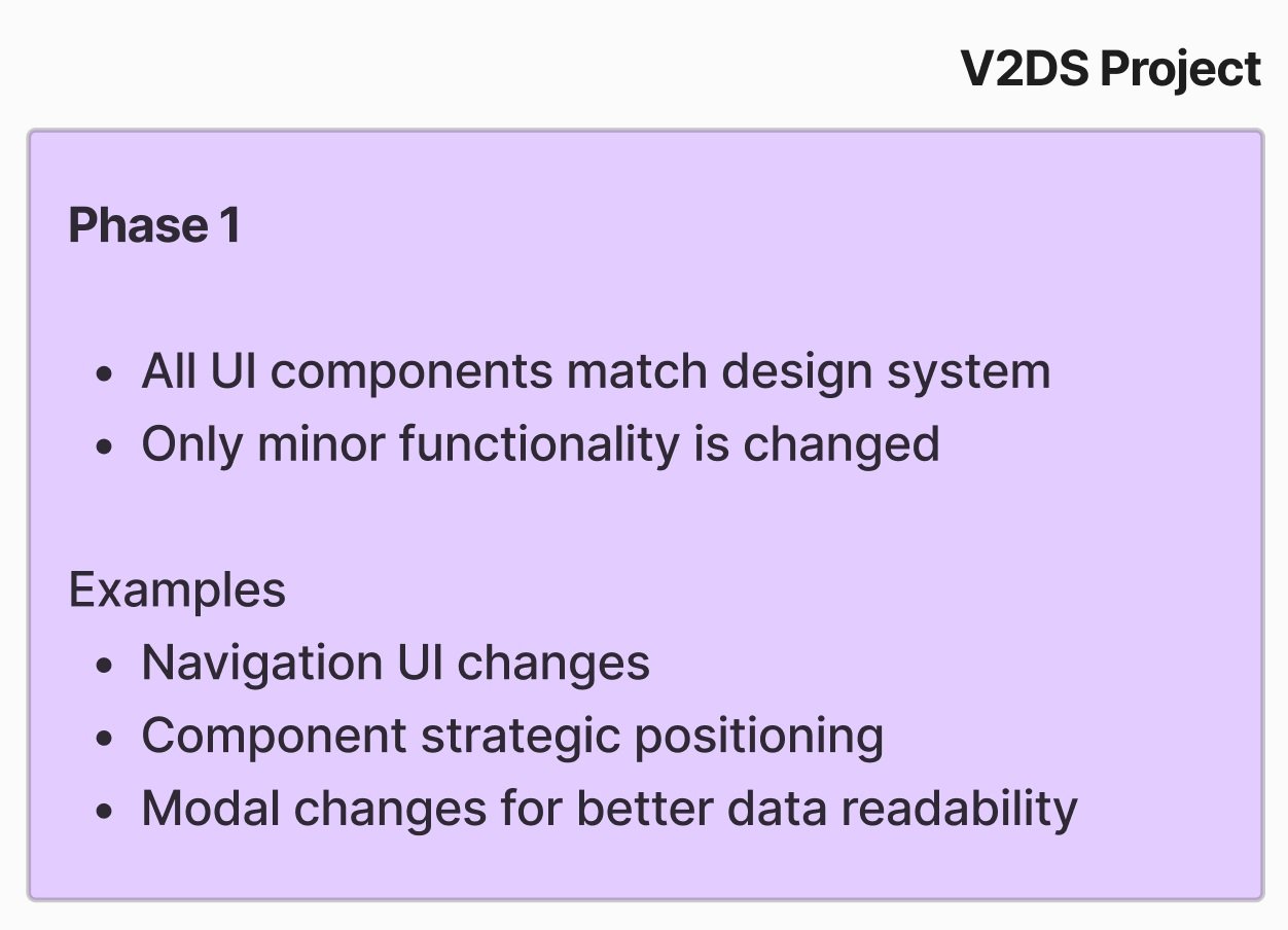
Phase 1
Phase 1 of the project focused primarily on updating the application's UI to match the design system. The goal was to establish a consistent visual language and interaction patterns within Vault, bringing it in line with other Ardent Mills digital products. While some minor functionality updates were included, the emphasis of Phase 1 was on the design system integration.

Phase 2
Phase 2 of the project was designated for implementing more significant improvements to the Vault application. This phase would involve in-depth user research to identify areas where the application could be enhanced to better meet user needs and improve workflow efficiency. It is important to note that Phase 2 was planned as a future endeavor, separate from the initial project.
Release Plan
A release plan was crucial for the successful deployment of the design system changes to the Vault application. This strategy enabled an iterative rollout, where updates were introduced incrementally, allowing users to adapt to the new design and functionality without being overwhelmed. By carefully staging the deployment, the project aimed to maximize user adoption and minimize support requests.
DESIGN SYSTEM ADDITIONS
This was a core deliverable, directly supporting the project's goal of aligning Vault with the design system and ensuring consistency. It focused on expanding the Ardent Mills Design System by creating new components and updating existing ones to meet the specific needs of the Vault application. The component library grew by 80% as a result of this effort and ensured that Vault's redesign would be consistent with the system's principles and component library. It also contributed to the overall growth and maturity of the design system, making it more comprehensive and adhering to higher quality standards for future projects.
Expansion
A significant focus was placed on the creation of new components to address gaps in Vault's functionality and improve the user experience. This involved designing and developing components such as accordions, chips, modals, segmented controls, tabs, tables and tooltips. The goal was to provide a wider range of reusable UI components that adhered to the design system's standards.
Refinement
In addition to creating new components, the project involved updating existing components to improve their functionality and composure. This included components such as buttons, form controls, progress steppers, and inputs. Updates focused on improving consistency, usability, and adherence to best practices.
Enhancement
Ensuring the quality of both new and existing components was paramount. This included rigorous testing, adherence to accessibility guidelines, and optimization for performance and responsiveness. The aim was to create components that were not only visually consistent but also robust, reliable, and user-friendly.
HIGH FIDELITY DESIGNS
High-fidelity designs reflecting the design system's guidelines and components were created to provide a clear blueprint for development and ensure accurate implementation of the intended user experience. These designs directly shaped the final look and feel of the redesigned Vault application, prioritizing consistency and usability.
To manage the design of the large and complex Vault application, a modular workflow was adopted. The application's core functional areas were defined as modules. Approaching it this way allowed the design effort to be broken down into more manageable, contextually relevant units. 1,260 frames were created to encompass the various states and user flows within these modules.
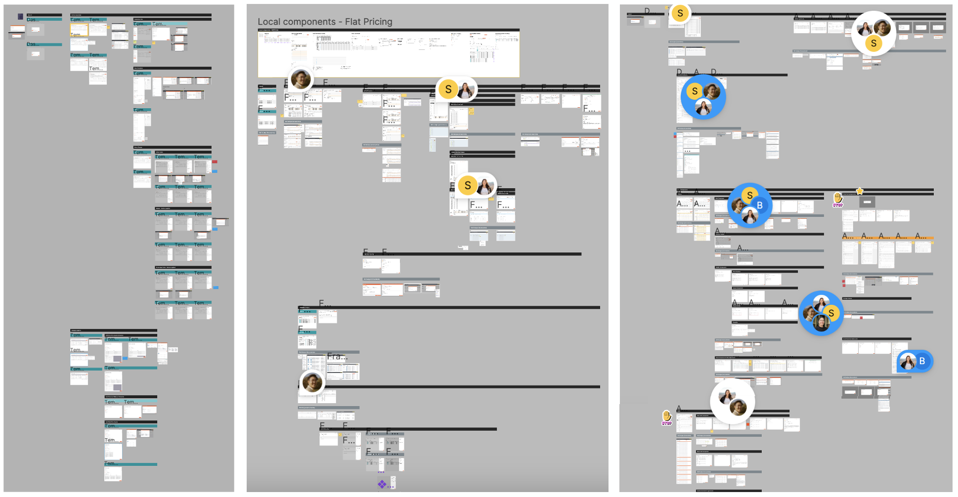
3 modules of 6 total

Alerts Redesign
A significant portion of the design effort focused on redesigning the application's alerts. This was treated as a mini-project within the larger initiative, resulting in the creation of 1,159 frames dedicated solely to this aspect. The redesign prioritized clear and concise communication of alert states, providing users with specific guidance on how to resolve issues and recover from errors, rather than simply displaying cryptic messages.
USER STORIES & EXPANDED RESPONSIBILITIES
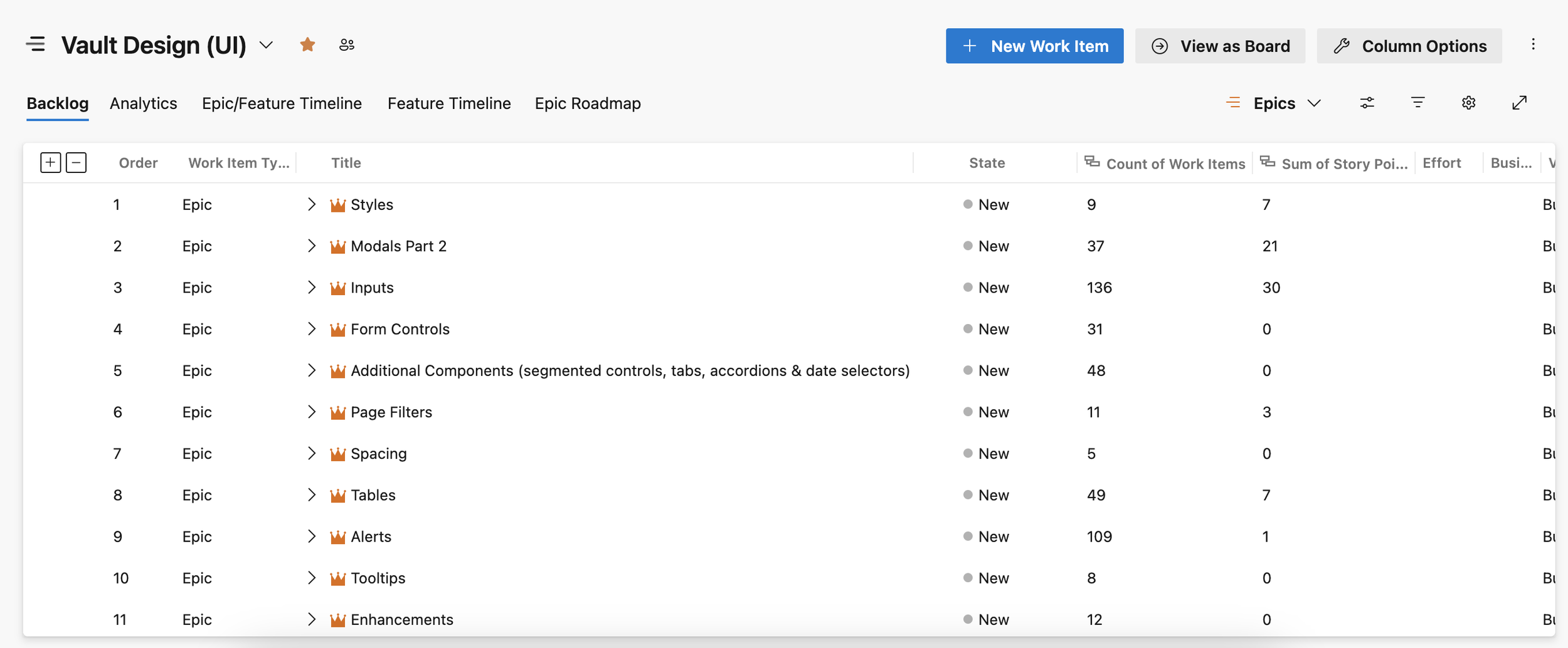
To overcome resource limitations during the project, Product Designers played a crucial role beyond traditional design tasks. Designers were required to assume responsibilities including epic, feature, and user story creation (resulting in the creation of 920 work items), backlog management, and development team coordination. These responsibilities are typically handled by Product Managers/Owners and Scrum Masters but were undertaken by the Product Design team to maintain project momentum and ensure the delivery of valuable, user-centered changes.
The project encountered difficulties in initial estimation, resource allocation, and dependencies between multiple teams. These challenges impacted the development timeline, resulting in the release of 25% of the designed changes. Despite this, the project achieved its key results and provided valuable learning experiences. A crucial aspect of the project's success was the strategic prioritization of design elements. My team prioritized the implementation of global styles, navigation, and modals to ensure the project delivered maximum value by addressing the most critical areas first. This strategic approach played a vital role in establishing usability and scalability for future development.
At the start of the project we implemented Microsoft Clarity to track user behavior within the application and effectively measure the impact of the design changes. Below are some of the metrics we tracked in the six months before the first release and the six months that followed the final release. While all of these improved, one result stood out the most. There was an 89% improvement in quickbacks. Microsoft Clarity detects quickbacks when a user moves from a new to previous page in shorter time than the defined threshold (the dwell time for that page). This typically indicates the user had trouble understanding the navigation or made a mistake. The dramatic improvement in quickbacks is a huge success for this project, because 60% of the components we implemented were navigational.
RESULTS
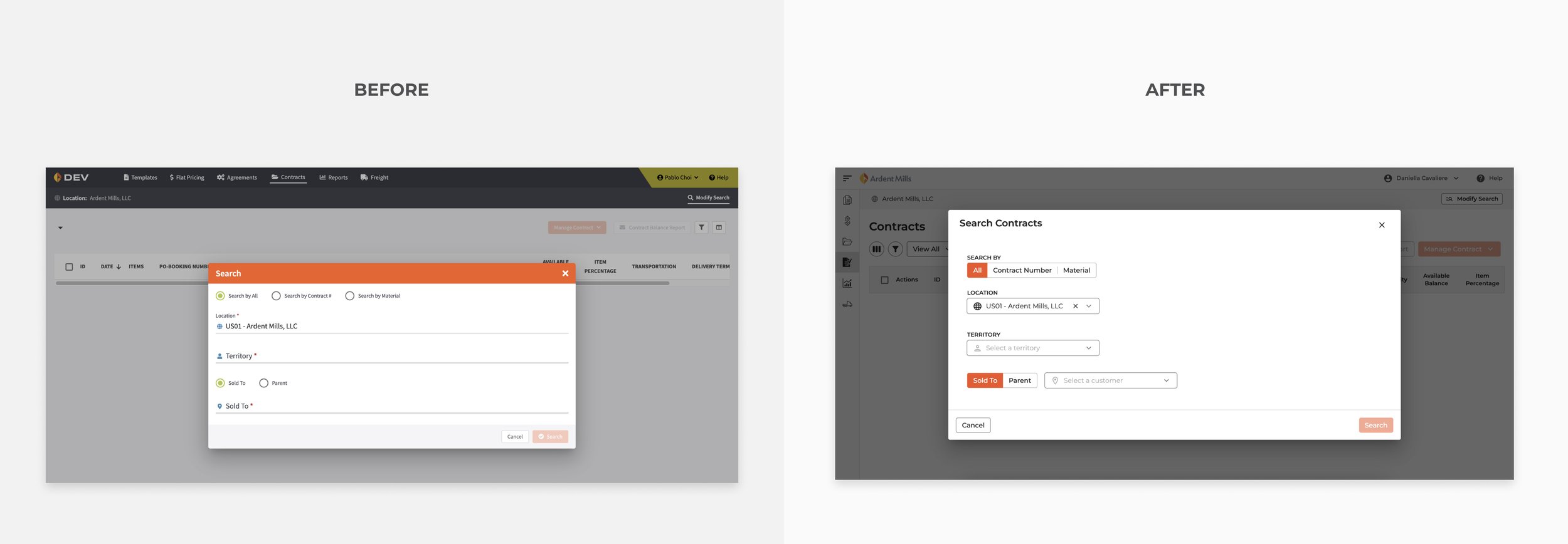
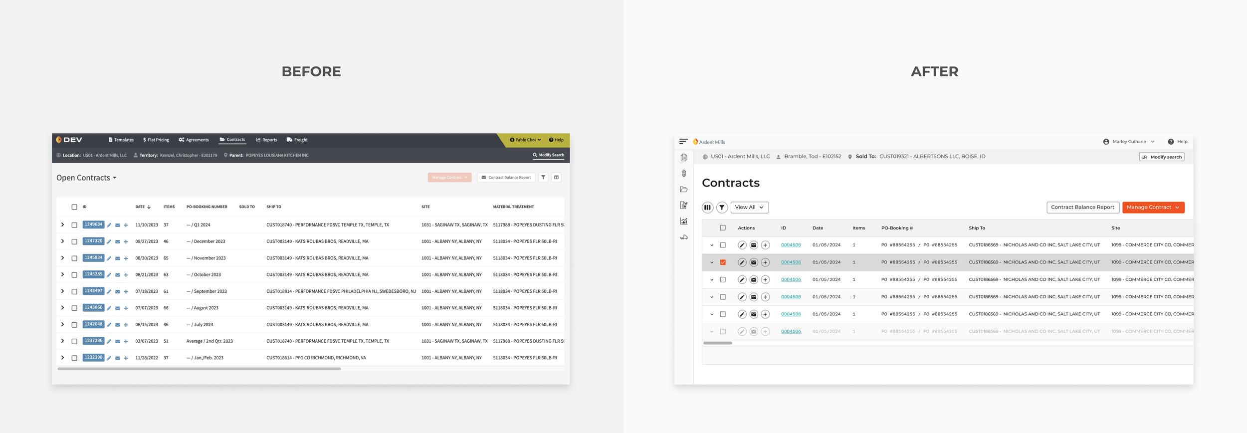
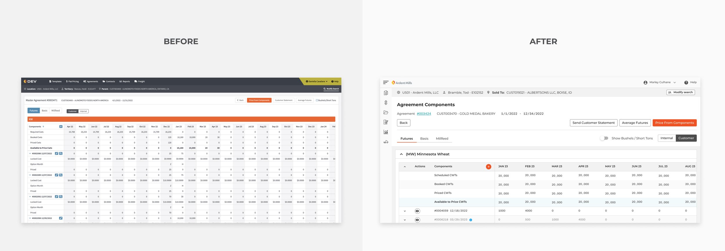
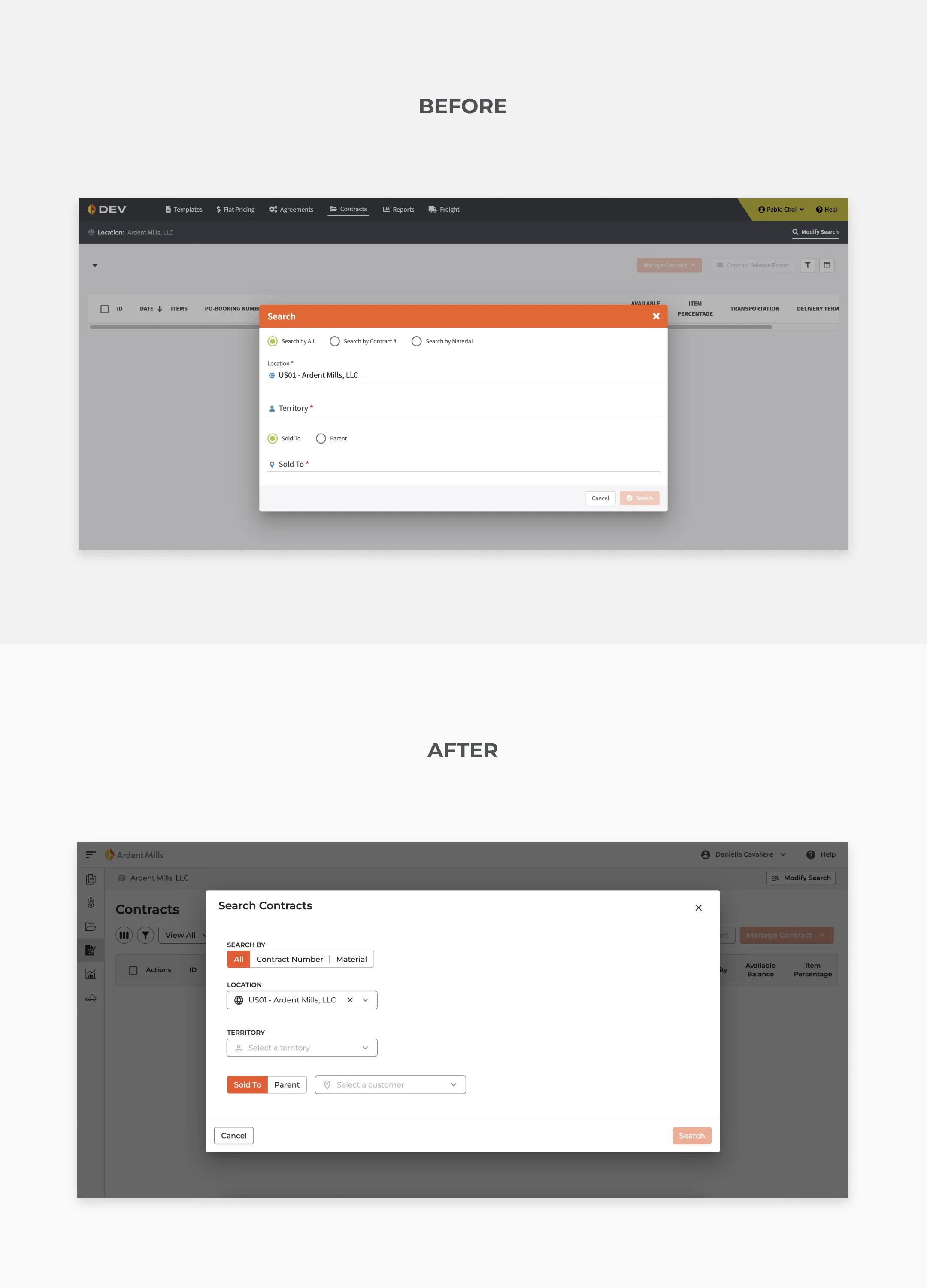
The improvements in usability and visual consistency are further demonstrated in the following before-and-after comparisons. The updated design is clearer, reduces cognitive load, and streamlines user workflows, ultimately leading to a more efficient and satisfying interaction with the Vault application.


TAKEAWAYS
The Vault Aligns to the Design System project successfully modernized the Vault application and made significant strides in aligning Vault with the broader Ardent Mills design system. While challenges were encountered, the project delivered significant accomplishments: improved usability, reduced errors, and a smoother onboarding process for new users. It also provided a strong foundation and valuable lessons to inform future design initiatives, all in service of creating a more consistent user experience across Ardent Mills' digital products.
Accomplishments
80% increase in design system components
95% of components coded in the component library
83% of global styles implemented in Vault
100% design completed
100% within budget
Implemented Microsoft Clarity for user behavior tracking
Challenges
Initial project estimation did not include an engineering perspective
Developers started later than planned due to another project's deadline
Multi-team dependencies caused confusion and delays
Resource constraints led to Product Designers being responsible for PM/PO/SM duties.
25% of designed changes were implemented in Vault
Lessons Learned
The importance of getting Devs involved earlier for timeline estimation
Make sure there is a dedicated PO for the project
Include user research in the future
Provide earlier release communication in the future