Ardent Mills Design System
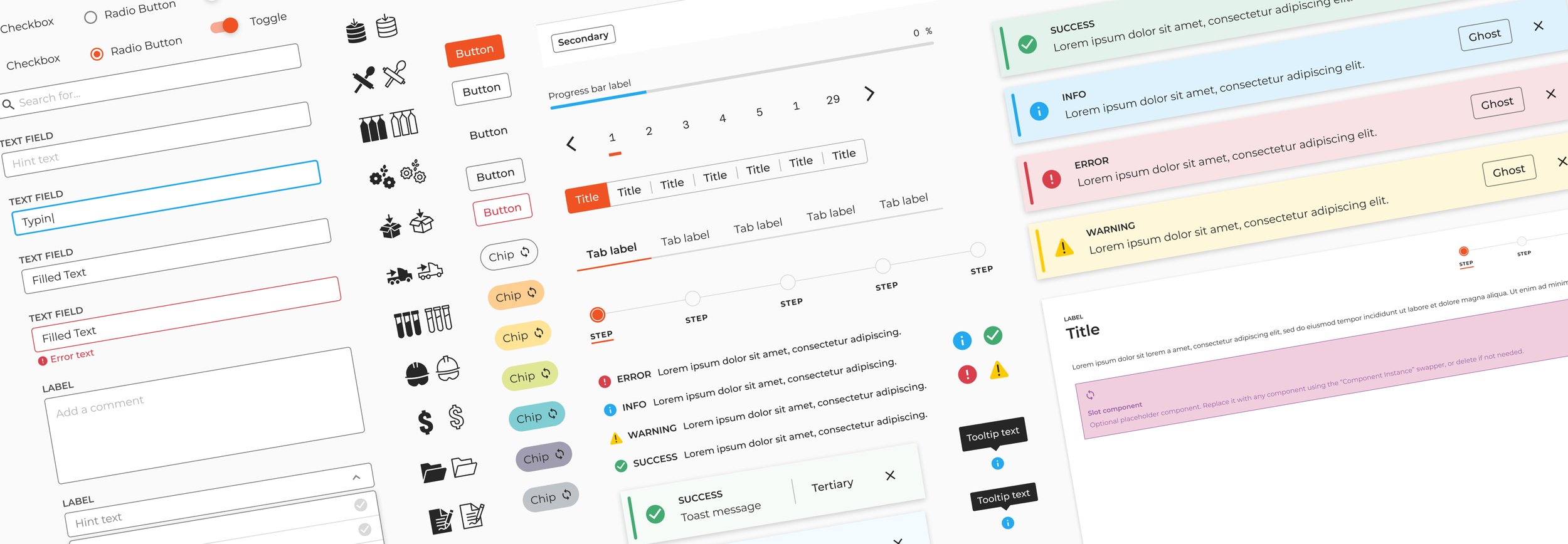
The Ardent Mills Design System was created and shipped to address the challenge of disjointed user experiences across Ardent Mills’ custom applications. It established a living comprehensive style guide that defines typography, colors, spacing, and interaction patterns, as well as, a central library of 30+ reusable UI components that are responsive, accessible, and usability focused. Paired with these is also documentation consisting of design guidelines and best practices.
OVERVIEW
ROLE
Project Lead & Lead Product Designer
CLIENT
Ardent Mills
WEBSITE
Ardent Mills Design System
Password: designsystem
CAPABILITIES
Product Design
Design Ops
Design Strategy
Information Architecture
Interaction Design
Accessibility
Governance
Content Strategy & Writing
OVERVIEW BY METRICS
100%
Reduction in unique hex code colors used
72%
Reduction in font families used
25
Components designed
and documented
30
Custom Icons designed and documented

ARDENT MILLS
Founded in 2009 from the merger of two industry giants, Ardent Mills is North America's leading flour supplier. They source grain from across the continent, meticulously milling it into the building blocks of countless meals.
But Ardent Mills goes beyond just producing high-quality flours and whole grains. They're passionate and committed to working alongside farmers to cultivate a more sustainable future for food. They're not just manufacturing ingredients; they’re cultivating a thriving agricultural ecosystem that nourishes their communities one grain at a time.
COMPANY
PIONEERING DESIGN
I joined Ardent Mills to found their UX practice and build a design-driven approach to software development. As their first Product Designer, (the company hadn't yet integrated design into their workflow) I had the unique opportunity to build a design practice from the ground up and champion user-centered design.
The initial days were spent building the foundation. This included creating a design system, establishing developer/designer workflows, building a core set of design tools, and raising awareness on the benefits of design. Slowly, but surely, design started gaining traction, and the design practice I built evolved from a solo mission to a collaborative force. With additional designers under my leadership, we transformed how the company approached product development and user experience.

Historically, Ardent Mills contracted out software design and development of their 3 business critical applications to 3 different contracting companies. Managing multiple frontend frameworks resulted in higher cost due to tech debt and slowed delivery timelines when interactions and other key pieces had to be rebuilt 3 times. Since there was no source of truth, this patchwork approach resulted in a confusing and disjointed user experience and hindered the ability to scale Ardent Mills' digital products effectively.
THE PROBLEM
PRISM
VAULT
CORE
GOALS
The goal of this project was to create a robust design system to unify the user experience across all Ardent Mills digital products and platforms. We aimed for the Ardent Mills Design System to be a centralized resource of design language, components, foundations and guidelines, thus saving time and resources by eliminating the need for designers and developers to recreate the wheel. This design system was meant to lead to a more consistent, user-friendly, and scalable digital brand for Ardent Mills.
THE PROCESS
DELIVERABLES
Foundations
Style Guide
Component Library
Documentation
Shared Visual Language
FOUNDATIONS
A strong design system relies on a solid foundation which consists of three crucial elements: Breakpoints, Grid, and Spacing. These seemingly simple concepts lay the groundwork for consistent, visually appealing, and responsive user experiences.
Breakpoints
In responsive design, Breakpoints represent the different screen sizes at which a website's layout adapts. By establishing breakpoints, designers and developers ensure the interface adjusts seamlessly across various devices, creating a seamless user experience regardless of the viewing platform.
Grid & Spacing
A well-defined grid paired with effective spacing creates organization and visual hierarchy, guiding the user's eye through the interface and making it easier to scan content. While most other design systems opt for an 8pt grid, we adopted a 4pt grid system instead. This allows for finer control over element placement and spacing, while still maintaining compatibility with the vast majority of devices.
White Space
Initially, our users had an affinity for densely packed interfaces. We found it necessary to demonstrate the essential role of white space for creating clear and digestible layouts. By strategically incorporating white space, we transformed cluttered designs into breathable focused experiences. This deliberate approach guides the user’s focus and reduces cognitive load.
STYLEGUIDE
The visual identity of a digital product is more than just aesthetics; it's about creating a recognizable and memorable brand experience. To achieve this consistency, I crafted a comprehensive style guide as part of the design system. The Style Guide serves as a central reference point for designers and developers, ensuring everyone contributes to a unified visual language.
Here's a glimpse into some of the key elements covered in our style guide, and why they matter:
Colors
Our color palette plays a critical role in establishing brand identity and conveying meaning. The style guide defines our primary, secondary, grayscale, semantic and data colors, along with their variations and corresponding hex codes. Offering an extensive palette provides a high degree of flexibility while maintaining brand recognition.
Typography
Typography establishes the tone of an interface and directly impacts how easily users can read and understand the information presented. The style guide specifies the core font families and their ideal usage for headings, body text, inputs and buttons. In addition to our core typeface, a monospaced font was chosen to prioritize readability, particularly for numerical data displayed in our numerous tables.
Iconography
Our icons are carefully crafted symbols which we use to visually communicate core elements of a product and available actions. The style guide outlines our three types: Product, Alert, and System Icons as well as their range of sizes.
COMPONENT LIBRARY
A crucial piece of the design system was the creation of a comprehensive component library. This library is important because it serves as the foundation for consistent and efficient product design.
Imagine building a house out of Legos. Meticulously assembling each individual brick would be incredibly time-consuming. Now, imagine having pre-built walls, doors, and windows – reusable components that drastically accelerate the construction process. This is the power of a component library in product design. This modular approach helps save valuable time and resources from reinventing the wheel each time, thus allowing designers and developers to spend more time on complex problems.
Here's a glimpse into my approach:
Prioritization
I began by identifying the most frequently used UI elements across our applications. This data-driven approach ensured the library would focus on the building blocks our digital products would need most.
Atomic Design Principles
Leveraging the principles of Atomic Design, I meticulously categorized components from basic atoms to complex molecules. This structure promotes reusability, simplifies complex layouts and propagates changes easily.
Collaboration is Key
Building the library wasn't a solo endeavor. I fostered close collaboration with developers to ensure seamless integration of components into our codebase. I also joined forces with additional designers two years later to double the amount of components in the design system.
The Ardent Mills component library is more than just a collection of UI elements. By empowering developers to efficiently translate designs into functional software, it lowers barriers to the adoption of the design system.
DOCUMENTATION
The design system isn't static; it's a centralized living document that continuously evolves. Throughout this evolution, comprehensive and up-to-date documentation plays a vital role in fostering efficiency and maintaining consistency. With this documentation in hand, teams can leverage the design system to its full potential, leading to a faster and more efficient development process.
Guidelines
The foundation of our design system lies in its clearly defined guidelines. These guidelines establish the core principles that govern the visual language, user interaction patterns, and overall user experience across all Ardent Mills’ digital products. They provide a roadmap for creating intuitive interfaces that not only look great but also function flawlessly.
Best Practices
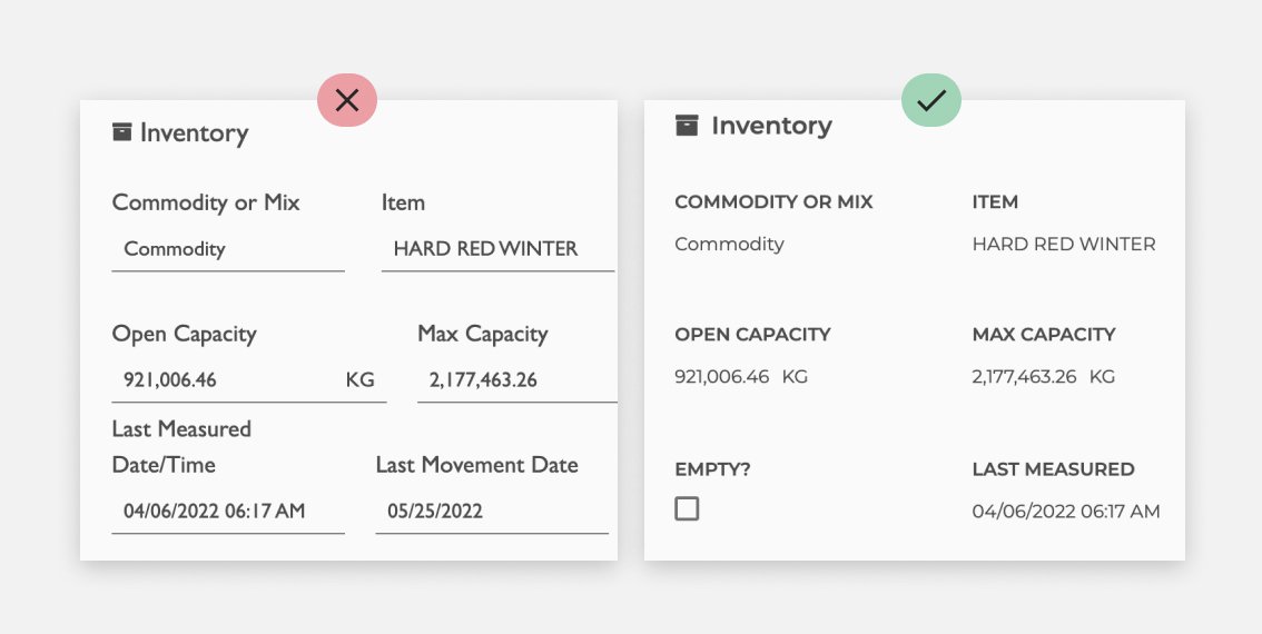
By providing dos & don’ts for each component, the best practice sections in the design system equip designers and developers with the knowledge to make informed design choices within the system's framework. This empowers them to focus their creativity on innovative solutions while maintaining a consistent user experience.
RESULTS
SHARED VISUAL LANGUAGE
A shared visual language is essential for creating a cohesive user experience across multiple digital products. Through the implementation of the design system, we successfully unified the look and feel of two business critical applications. The third was transitioned to a backend application (<10 users) which provides data to the others. The screenshots below show the PRISM and VAULT applications before and after. This consistent visual identity strengthens brand recognition and enhances user satisfaction.
PRISM
VAULT
TAKEAWAYS
This project was a difficult yet rewarding journey filled with challenges and lessons. Managing the design of 25 components alongside a scrum team of 6 dedicated developers required coordination and transparent communication. It wasn't just about building a collection of UI elements; it was about establishing a foundation for a unified design language across the company. We aimed to foster brand recognition and enhance user experience across all applications and platforms. Our accomplishments and metrics prove we were successful.
Accomplishments
Increased design consistency across Ardent Mills digital products
Improved development efficiency for new features
Positive user feedback on the overall user experience
Lessons Learned
Start small, scale up
Embrace flexibility
Think beyond UI
Measure success
Design systems are a great tool and provide a strong foundation for streamlining design and development, but it's worth noting that they have limitations and don't address every aspect of Product Design and Development, particularly when it comes to deeper interaction or content-related challenges.


